

This article was last updated on September 09, 2024, to add sections on Advanced Responsive Design, Built-in Accessibility Features, Testing Mantine Applications, and Mantine’s Customization and Theming Options.
Introduction
Mantine is a lightweight and easy-to-use library that provides a wide range of components and hooks for building high-performance web applications. It is built on top of React and TypeScript, making it a great choice for building modern web applications.
Steps we'll be taking in this article:
- Setting Up Mantine UI
- Mantine UI Hooks
- Why Mantine UI?
- Mantine UI Components
- Exploring the Use Case of Mantine Component
- Responsive Design Made Easy with Mantine
- Accessibility Features in Mantine UI**
- Bonus: Testing Mantine Applications with Jest and React Testing Library
- Theming and Customization
Setting Up Mantine UI
Mantine can be used with React,Refine, Next, Vite, Remix, and Gatsby.
In this article, we will be using Next. To install Mantine in a Next application follow the detailed steps below:
npx create-next-app@latest --typescript
Mantine has a list of packages that can be used in your project this is what they look like:
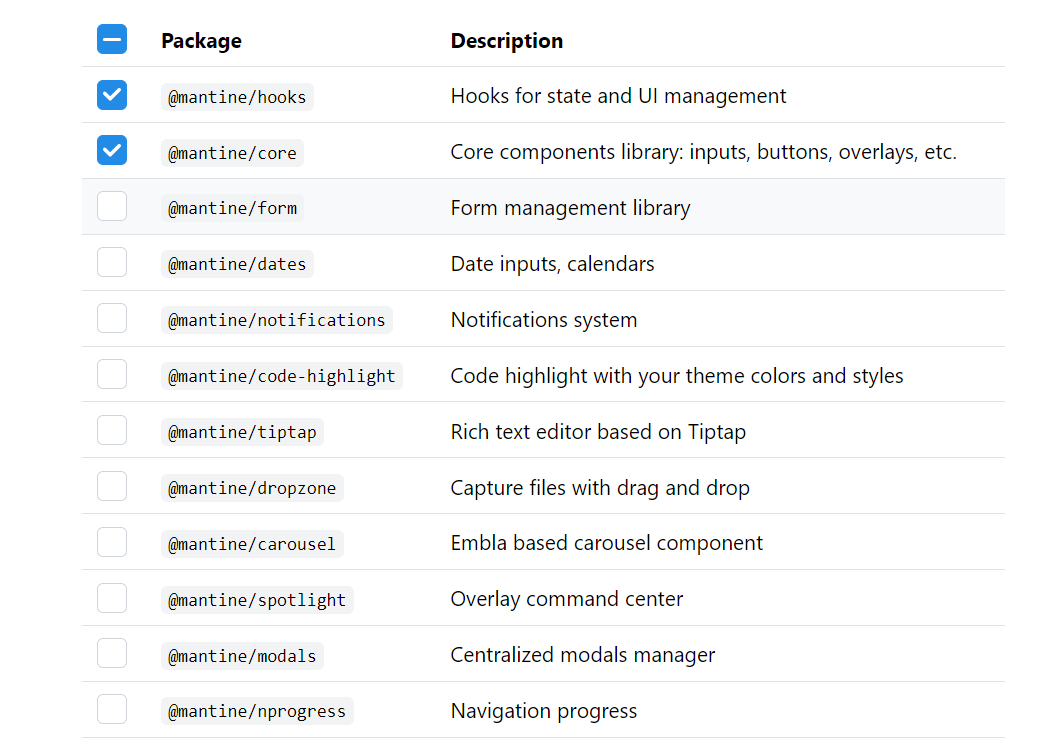
By selecting anyone you could add them to the installation process:
npm install @mantine/core @mantine/hooks
Now let's setup MantineProvider in our application:
Set up MantineProvider
In your Next.js application, you'll want to wrap your entire app with the MantineProvider component. You can do this by creating a _app.js file in your pages directory if it doesn't already exist, and then import MantineProvider and wrap your Component with it. Here's an example of what your _app.js file might look like:
import React from "react";
import { MantineProvider } from "@mantine/core";
import "../styles/globals.css"; // Import your global styles here

function MyApp({ Component, pageProps }) {
  return (
    <MantineProvider>
      <Component {...pageProps} />
    </MantineProvider>
  );
}

export default MyApp;
Start Using Mantine Components
You can now start using Mantine components in your Next.js application. For example, create a new component in the components directory and use Mantine components inside it:
import React from "react";
import { Button } from "@mantine/core";

function MyComponent() {
  return <Button>Hello, Mantine!</Button>;
}

export default MyComponent;
Then, import and use MyComponent in your pages:
import React from "react";
import MyComponent from "../components/MyComponent";

function Home() {
  return (
    <div>
      <h1>Welcome to My Next.js App with Mantine!</h1>
      <MyComponent />
    </div>
  );
}

export default Home;
Run Your Next.js Application
Finally, run your Next.js application to see the Mantine components in action:
npm run dev
Your Next.js application with Mantine is now set up and ready to go! You can continue to explore Mantine's Hooks and components and integrate them into your project as needed
Mantine UI Hooks
Hooks were introduced to change the way React components are built as they are meant to simplify component logic. They allow you to use state and other React features in functional components without writing a class. This makes the code cleaner and easier to understand.
With hooks, the logic can be reused (like fetching data or subscribing to external events) can be encapsulated in custom hooks. These custom hooks can be reused across different components and even different projects, promoting reusability.
Mantine as a React component Library utilizes custom hooks to manage state, manipulate the DOM, and handle design-related functionalities. These custom hooks are designed to simplify complex tasks, such as managing form state, handling user interactions, managing modals, and more.
Let’s explore a few of these hooks;
The useClipboard()
The useClipboard hook is a custom hook worth of mention. This hook simplifies working with the clipboard by providing an easy-to-use interface. It accepts an options argument, which defines the timeout duration (in milliseconds) for the copied status. If the copy function is called within the specified timeout, the copied value will be true, indicating that the copy operation was successful within that timeframe.
Here's the TypeScript definition of the useClipboard hook for reference:
function useClipboard(options: { timeout: number } = { timeout: 2000 }): {
  copy: (valueToCopy: any) => void;
  reset: () => void;
  error: Error;
  copied: boolean;
};
Here's a breakdown of the properties returned by the useClipboard() hook:
copy: (valueToCopy: any) => void: This is a function that you can call with the value you want to copy to the clipboard. For example, if you want to copy a string, you would call copy('text to copy').
reset: () => void: This function clears the timeout and resets the copied value. You can use this function if you want to reset the copied status manually.
error: Error: This property contains an Error object if something goes wrong during the copying process. For example, if the browser does not support the clipboard API or if there are other issues, the error property will be populated with an error object.
copied: boolean: This property is a boolean value that indicates whether the copy function was called less than options.timeout milliseconds ago. If it was, copied is true; otherwise, it is false. This property is useful for showing feedback to the user, such as displaying a message like "Copied!" after a successful copy operation.
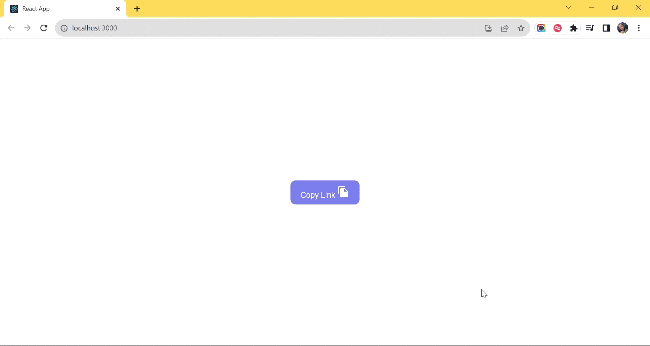
Let’s use this hook to simplify clipboard interactions in our React application:
import React from "react";
import { useClipboard } from "@mantine/hooks";

import FileCopyIcon from "@mui/icons-material/FileCopy";

const App: React.FC = () => {
  const items = ["https://refine.dev/blog/"];
  const clipboard = useClipboard({ timeout: 1500 });
  return (
    <div>
      <ul>
        {items.map((description, index) => (
          <li key={index}>
            <button onClick={() => clipboard.copy(description)}>
              {clipboard.copied ? (
                <span>Copied! </span>
              ) : (
                <span>Copy Link </span>
              )}
              <FileCopyIcon />
            </button>
          </li>
        ))}
      </ul>
    </div>
  );
};

export default App;
let's take a look at what it looks like:
UseWindowScroll()
Building a web page involves making it as interactive as possible and making ease of use a top priority. If you are conversant with blogs, especially those bulky ones, where you must have scrolled a lot and you just want to go back to the top of the web page, scrolling backup becomes stressful.
As developers, we prioritize enhancing user experience, and this is where the useWindowScroll() hook comes into play. This hook seamlessly interacts with the DOM, providing access to the current scroll position and enabling smooth scrolling to a specific location on the page.
This is what the actual implementation looks like:
import { useWindowScroll } from "@mantine/hooks";
import { Button, Text, Group } from "@mantine/core";

export default function App() {
  const [scroll, scrollTo] = useWindowScroll();

  return (
    <Group className="center">
      <Button onClick={() => scrollTo({ y: document.body.scrollHeight })}>
        Scroll to Bottom
      </Button>
      <Text>//Long Text</Text>
      <Button onClick={() => scrollTo({ y: 0 })}>Scroll to top</Button>
    </Group>
  );
}
Use-Disclosure
The useDisclosure() hook is our last tool on the list and it deserves recognition. useDisclosure() simplifies managing boolean state in React applications. It's particularly useful for handling components like modals, popovers, and other UI elements that need to be conditionally displayed or hidden based on user interactions.
Open, Close, and Toggle Handlers hooks provide intuitive open(), close(), and toggle() handlers. These functions abstract away the complexities of managing state transitions, making it easier to control when a component should be displayed or hidden.
The hook accepts optional onOpen and onClose callbacks. These callbacks enable you to execute specific actions or logic when the component is opened or closed. For instance, you could perform additional tasks or trigger animations when a modal opens or closes.
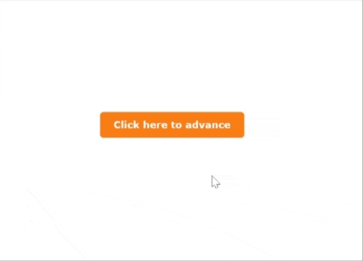
Let’s look at how this is implemented:
import React from "react";
import { useDisclosure } from "@mantine/hooks";
import { Modal, Button, Group, Col, Container } from "@mantine/core";

export default function App() {
  const [opened, { open, close }] = useDisclosure(false);

  return (
    <div>
      <Modal
        opened={opened}
        onClose={close}
        title="We use cookies"
        centered
        size="sm"
      >
        <p>
          This website uses cookies to ensure you get the best experience on our
          website.
        </p>
        <Container mt={4}>
          <Group position="right">
            <Button color="gray" onClick={close}>
              Decline
            </Button>
            <Button variant="filled" color="blue" onClick={close}>
              Accept
            </Button>
          </Group>
        </Container>
      </Modal>
      <Button onClick={open}>Click here to advance</Button>
    </div>
  );
}
let's take a look at what it looks like:
Why Mantine UI?
Browser Support and Compatibility
Mantine dedicatedly ensures compatibility and functionality across major browsers, including Chrome, Safari, Firefox, Edge, Safari for iOS, and Chrome for Android. Components and hooks are tested and optimized for Chromium browsers (version 108+), Firefox (version 101+), and Safari (version 15.4+).
While older versions like IE are unsupported, Mantine seamlessly integrates with React versions, ensuring broad compatibility. For older browser support, users can refer to specific component documentation and implement necessary polyfills.
Reliable Release Cycle and Community-Driven Development
Mantine follows a clear plan when it's updated, making it stable and reliable. They make small improvements every month in minor updates, and bigger changes happen less often in major updates.
What's great is that many people help make Mantine better - over 300 contributors are part of this community effort! Mantine UI isn't just a library; it's a vibrant ecosystem where user experience meets innovation.
User-Friendly Components
Mantine provides a large range of user-friendly components that are very easy to implement. Whether you need buttons, forms, modals, or navigation elements, Mantine's components are developer-friendly, making the development process smooth and easy.
Performance Optimization
Mantine’s components are lightweight, ensuring fast loading times and smooth user interactions. This makes it an excellent choice for building high-performance web applications.
Customization and Theming
Mantine offers extensive customization options. You can easily customize the appearance of components to match your brand identity. With theming support, you can create consistent and visually appealing designs across your entire application.
Mantine UI Components
Mantine as a UI library simplifies the development process with the use of inbuilt easy-to-use components. We will explore the core aspects of Mantine's UI components, providing an overview of the available components and diving into some of its flagship elements which are: Forms and Inputs, Navigation, Notifications, Modals, and Theming.
Mantine offers a wide array of components that cater to various UI requirements. Some of the core components include:
Forms and Inputs:
- **Text Input:** Allows users to input text data.
- **Textarea:** Provides a multi-line text input field.
- **Select:** A dropdown menu for selecting options.
- **Radio:** A set of radio buttons for single-choice selection.
- **Checkbox:** Checkboxes for multiple-choice selection.
- **Form:** A container for grouping and handling form elements.
Navigation:
- **Tabs:** Horizontal navigation tabs for switching between content.
- **Breadcrumbs:** Indicates the current page's location within the website hierarchy.
- **Menu:** A dropdown menu for navigation or actions.
Notifications and Modals:
- **Notifications:** Provides feedback messages to users.
- **Modals:** Dialog boxes or pop-ups for interactive user input or messages.
- **Popover:** A small overlay for additional information or actions.
- **Tooltip:** Displays additional information when hovering over an element.
Data Display:
- **Avatar:** Displays profile pictures or avatars.
- **Badge:** Small containers to highlight certain information.
- **Card:** Container component for displaying various types of content.
- **Table:** Displays data in a tabular format.
- **List:** Renders a list of items.
- **Typography:** Includes various text styles, headings, and paragraphs.
Utilities:
- **Col:** Defines a column layout within a grid.
- **Row:** Defines a row layout within a grid.
- **Container:** A responsive container for managing layout width.
- **Image:** Displays images with various customization options.
Exploring the Use Case of Mantine Component
In this section, we will be looking at the various implementations of the Mantine components and how they can be utilized in our projects.
Forms and Inputs
Mantine's form components are designed for ease of use and customization. For instance, the TextInput component allows developers to create input fields with various styles, validations, and placeholder texts. The Form component simplifies form management, elegantly handling form submissions, validations, and error messages.
import { TextInput, Checkbox, Button, Group, Box } from "@mantine/core";
import { useForm } from "@mantine/form";

function App() {
  const form = useForm({
    initialValues: {
      email: "",
      termsOfService: false,
    },
    validate: {
      email: (value) => (/^\S+@\S+$/.test(value) ? null : "Invalid email"),
    },
  });

  return (
    <Box maw={340} mx="auto">
      <form onSubmit={form.onSubmit((values) => console.log(values))}>
        <TextInput
          withAsterisk
          label="Email"
          placeholder="please provide your valid @email.com"
          {...form.getInputProps("email")}
        />
        <Checkbox
          mt="md"
          label="I agree to read Refine's Blog always"
          {...form.getInputProps("termsOfService", { type: "checkbox" })}
        />
        <Group justify="flex-end" mt="md">
          <Button type="submit">Submit</Button>
        </Group>
      </form>
    </Box>
  );
}

export default App;

Navigation:
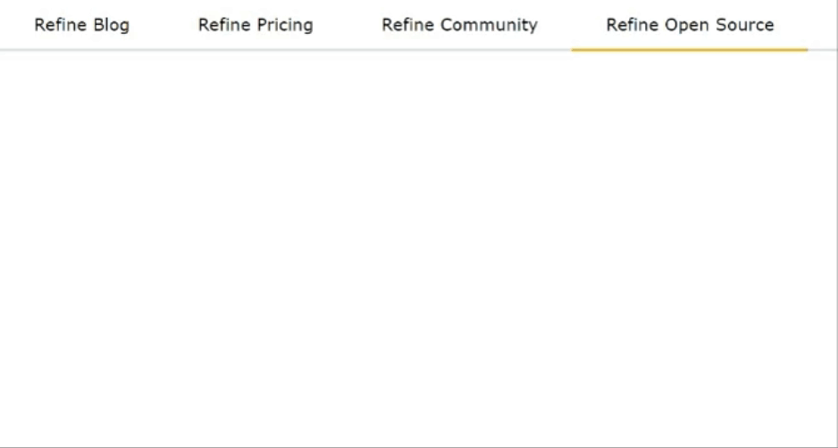
Mantine offers various navigation components, such as Menu, Tab, and Pagination, enhancing the user experience. Tabs enable organized content switching, while Paginations Display active pages and navigate between multiple pages. Menus and Dropdowns simplify complex navigational hierarchies.
import { Tabs } from "@mantine/core";

function App() {
  return (
    <Tabs defaultValue="first">
      <Tabs.List>
        <Tabs.Tab value="first" color="blue">
          Refine Blog
        </Tabs.Tab>
        <Tabs.Tab value="second" color="red">
          Refine Pricing
        </Tabs.Tab>
        <Tabs.Tab value="third" color="green">
          Refine Community
        </Tabs.Tab>
        <Tabs.Tab value="fourth" color="yellow">
          Refine Open Source
        </Tabs.Tab>
      </Tabs.List>
    </Tabs>
  );
}

export default App;
import { Pagination } from "@mantine/core";

export default function App() {
  return <Pagination total={36} />;
}
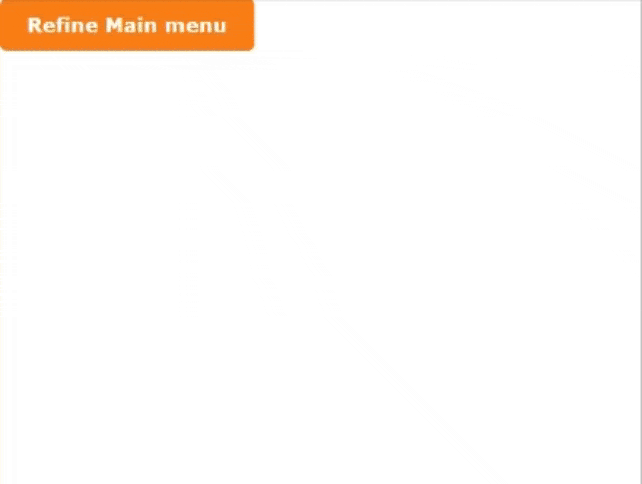
import { Menu, Button, Text, rem } from "@mantine/core";
import {
  IconSettings,
  IconSearch,
  IconPhoto,
  IconMessageCircle,
  IconTrash,
  IconArrowsLeftRight,
} from "@tabler/icons-react";

export default function App() {
  return (
    <Menu shadow="md" width={200}>
      <Menu.Target>
        <Button>Main menu</Button>
      </Menu.Target>
      <Menu.Dropdown>
        <Menu.Label>Application</Menu.Label>
        <Menu.Item
          leftSection={
            <IconSettings style={{ width: rem(14), height: rem(14) }} />
          }
        >
          blog
        </Menu.Item>
        <Menu.Item
          leftSection={
            <IconMessageCircle style={{ width: rem(14), height: rem(14) }} />
          }
        >
          Pricing
        </Menu.Item>
        <Menu.Item
          color="red"
          leftSection={
            <IconPhoto style={{ width: rem(14), height: rem(14) }} />
          }
        >
          Github
        </Menu.Item>
        <Menu.Item
          leftSection={
            <IconSearch style={{ width: rem(14), height: rem(14) }} />
          }
        >
          Search
        </Menu.Item>
        <Menu.Divider />
      </Menu.Dropdown>
    </Menu>
  );
}
Responsive Design Made Easy with Mantine
I wanted to share some insights on how we can use Mantine to make our applications more responsive and mobile-friendly. Mantine comes with built-in tools that help us handle different screen sizes easily, ensuring our applications look great on all devices.
Here are a few key features Mantine offers for responsive design:
Grid System
Mantine’s grid system makes it simple to create responsive layouts. With the Col and Grid components, we can easily control how many columns a component should span at different screen sizes.
<Grid>
  <Col span={12} md={6} lg={4}>
    <div>Content 1</div>
  </Col>
  <Col span={12} md={6} lg={4}>
    <div>Content 2</div>
  </Col>
  <Col span={12} md={12} lg={4}>
    <div>Content 3</div>
  </Col>
</Grid>
Here, each column adjusts based on the screen size—taking up the full width on small screens, half width on medium screens, and one-third width on larger screens.
Media Queries
We can also use media queries directly in Mantine to adjust styles based on the viewport size. This allows us to make text or other elements responsive with minimal effort.
const useStyles = createStyles((theme) => ({
  responsiveText: {
    fontSize: theme.fontSizes.sm,

    [theme.fn.largerThan("md")]: {
      fontSize: theme.fontSizes.lg,
    },
  },
}));

function ResponsiveText() {
  const { classes } = useStyles();
  return <div className={classes.responsiveText}>This text is responsive!</div>;
}
Flexbox Utilities
Mantine also provides helpful flexbox utilities, which make it easy to build flexible layouts that adapt to different screen sizes.
<Flex justify="space-between" wrap="wrap">
  <Button>Button 1</Button>
  <Button>Button 2</Button>
  <Button>Button 3</Button>
</Flex>
In this example, the buttons will automatically wrap on smaller screens.
Responsive Typography and Spacing
Mantine allows us to adjust typography and spacing based on screen size, ensuring our content is readable and looks good across all devices.
<Text size="sm" md={{ size: "lg" }}>
  This text will be small on mobile and large on desktops.
</Text>
By using Mantine’s built-in responsive design features, we can easily create layouts that work well on both mobile and desktop devices.
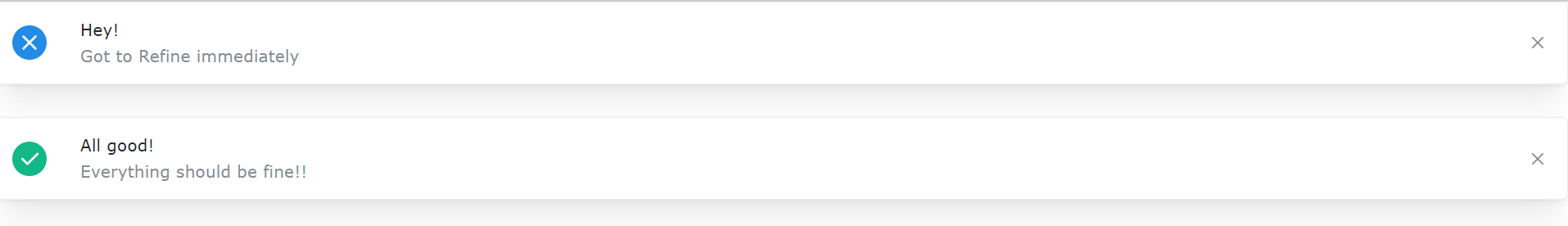
Notifications Mantine's notifications and modals provide user feedback and interactive dialogues. Notifications offer informative or alerting messages to users, while modals and popovers facilitate interactive tasks, ensuring a seamless user experience. Let’s look at how this is implemented below:
import { IconX, IconCheck } from "@tabler/icons-react";
import { Notification, rem } from "@mantine/core";

function App() {
  const xIcon = <IconX style={{ width: rem(20), height: rem(20) }} />;
  const checkIcon = <IconCheck style={{ width: rem(20), height: rem(20) }} />;

  return (
    <>
      <Notification icon={xIcon} color="blue" title="Hey!">
        Got to Refine immediately
      </Notification>
      <Notification icon={checkIcon} color="teal" title="All good!" mt="md">
        Everything should be fine!!
      </Notification>
    </>
  );
}

export default App;
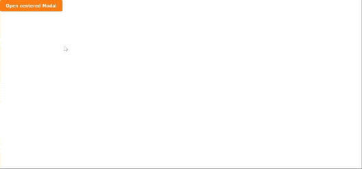
import { useDisclosure } from "@mantine/hooks";
import { Modal, Button } from "@mantine/core";
import { TextInput, Checkbox, Group, Box } from "@mantine/core";
import { useForm } from "@mantine/form";

export default function App() {
  const [opened, { open, close }] = useDisclosure(false);

  const form = useForm({
    initialValues: {
      email: "",
      termsOfService: false,
    },
    validate: {
      email: (value) => (/^\S+@\S+$/.test(value) ? null : "Invalid email"),
    },
  });

  return (
    <>
      <Modal opened={opened} onClose={close} title="Refine form" centered>
        <Box maw={340} mx="auto">
          <form onSubmit={form.onSubmit((values) => console.log(values))}>
            <TextInput
              withAsterisk
              label="Email"
              placeholder="please provide your valid @email.com"
              {...form.getInputProps("email")}
            />
            <Checkbox
              mt="md"
              label="I agree to read Refine's Blog always"
              {...form.getInputProps("termsOfService", { type: "checkbox" })}
            />
            <Group>
              <Button className="BTN" onClick={close} type="submit">
                Submit
              </Button>
            </Group>
          </form>
        </Box>
      </Modal>
      <Button onClick={open}>Open centered Modal</Button>
    </>
  );
}
Accessibility Features in Mantine UI**
I wanted to share some insights on Mantine’s built-in accessibility features that can really help us make our application more inclusive.
Mantine ensures its components are accessible by default and adhere to WCAG guidelines. For example, components like buttons, forms, and modals come with pre-configured ARIA attributes, making them easy for screen readers to interpret. This means we don’t have to manually add ARIA roles and attributes to most interactive elements.
For instance, the Modal and TextInput components are automatically configured with the appropriate roles and labels, simplifying the process of making the UI accessible to all users:
<Modal
  opened={opened}
  onClose={close}
  title="Subscribe"
  aria-labelledby="modal-title"
>
  <h1 id="modal-title">Join Our Newsletter</h1>
  <TextInput aria-label="Email address" placeholder="Enter your email" />
</Modal>
Bonus: Testing Mantine Applications with Jest and React Testing Library
I wanted to share some best practices for testing Mantine components using Jest and React Testing Library. Writing tests for Mantine components ensures our UI behaves as expected and helps catch issues early.
Unit Testing with Jest
You can write unit tests for individual Mantine components like buttons, modals, or forms. Jest works seamlessly with Mantine.
import { render, screen } from "@testing-library/react";
import { Button } from "@mantine/core";

test("renders Mantine Button with correct label", () => {
  render(<Button>Click me</Button>);
  const buttonElement = screen.getByText(/Click me/i);
  expect(buttonElement).toBeInTheDocument();
});
Testing User Interactions
With React Testing Library, you can simulate user actions like button clicks and form submissions, which is helpful for testing interactive Mantine components.
import { render, screen, fireEvent } from "@testing-library/react";
import { Button } from "@mantine/core";

test("button click triggers event handler", () => {
  const handleClick = jest.fn();
  render(<Button onClick={handleClick}>Click me</Button>);

  const buttonElement = screen.getByText(/Click me/i);
  fireEvent.click(buttonElement);

  expect(handleClick).toHaveBeenCalledTimes(1);
});
Testing Forms and Validation
Mantine’s form components can be tested for validation behavior by simulating form submissions and input changes.
import { render, screen, fireEvent } from "@testing-library/react";
import { TextInput, Button } from "@mantine/core";
import { useForm } from "@mantine/form";

function TestForm() {
  const form = useForm({
    initialValues: { email: "" },
    validate: {
      email: (value) => (/\S+@\S+/.test(value) ? null : "Invalid email"),
    },
  });
  return (
    <form onSubmit={form.onSubmit(() => {})}>
      <TextInput label="Email" {...form.getInputProps("email")} />
      <Button type="submit">Submit</Button>
    </form>
  );
}

test("form shows validation error for invalid email", () => {
  render(<TestForm />);
  fireEvent.change(screen.getByLabelText(/Email/i), {
    target: { value: "invalid-email" },
  });
  fireEvent.click(screen.getByText(/Submit/i));
  expect(screen.getByText(/Invalid email/i)).toBeInTheDocument();
});
Snapshot Testing
Snapshot tests ensure the UI doesn’t change unexpectedly. You can capture the rendered output of Mantine components and compare it against future changes.
import { render } from "@testing-library/react";
import { Button } from "@mantine/core";

test("Button matches snapshot", () => {
  const { asFragment } = render(<Button>Snapshot Button</Button>);
  expect(asFragment()).toMatchSnapshot();
});
Testing Modals and Popovers
Modals and popovers can be tested for conditional rendering by checking if they open and close correctly.
import { render, screen, fireEvent } from "@testing-library/react";
import { Modal, Button } from "@mantine/core";
import { useState } from "react";

function ModalExample() {
  const [opened, setOpened] = useState(false);
  return (
    <>
      <Button onClick={() => setOpened(true)}>Open Modal</Button>
      <Modal
        opened={opened}
        onClose={() => setOpened(false)}
        title="Test Modal"
      >
        Modal content
      </Modal>
    </>
  );
}

test("modal opens and closes correctly", () => {
  render(<ModalExample />);
  fireEvent.click(screen.getByText(/Open Modal/i));
  expect(screen.getByText(/Modal content/i)).toBeInTheDocument();
  fireEvent.click(screen.getByLabelText(/Close modal/i));
  expect(screen.queryByText(/Modal content/i)).not.toBeInTheDocument();
});
Mocking Mantine Hooks
If you're using Mantine hooks like useForm or useClipboard, you can mock them to test their behavior.
import { render, screen, fireEvent } from "@testing-library/react";
import { useClipboard } from "@mantine/hooks";

jest.mock("@mantine/hooks", () => ({
  useClipboard: jest.fn(),
}));

test("useClipboard hook is called", () => {
  const copy = jest.fn();
  useClipboard.mockReturnValue({ copy, copied: false });

  render(<button onClick={() => copy("text")}>Copy text</button>);
  fireEvent.click(screen.getByText(/Copy text/i));

  expect(copy).toHaveBeenCalledWith("text");
});
Theming and Customization
Mantine allows extensive theming and customization, allowing developers to align the UI with the brand identity. The MantineProvider component wraps the entire application, providing a context for theme customization. Themes include color schemes, typography, spacing, and other design elements, enabling a consistent look and feel across components.
import { MantineProvider, Container, TextInput } from "@mantine/core";

function App() {
  return (
    <MantineProvider theme={{ colorScheme: "dark" }}>
      <Container>
        <TextInput label="Dark Mode Input" placeholder="Enter text" />
      </Container>
    </MantineProvider>
  );
}
Conclusion
Mantine UI is one of the popular tools to help in building modern React applications. It's comprised of many pre-built components, helpful hooks, and easy-to-customize themes. With this, development becomes faster and more straightforward. Whether you are dealing with responsive design, state management, or need to improve user interaction, Mantine will definitely help you create great and easy-to-use interfaces without a lot of effort.